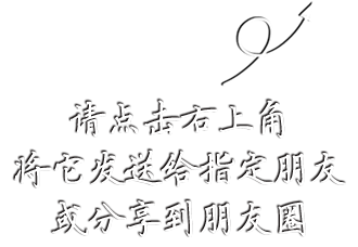
css|自适应
要实现的是head foot固定,中间区域随内容高度自适应,拖动滚动条时foot永远居底。

的方案给了我一个很好的思路,但关键部分是原创的,一直以为会比SolarDreamStudios的方案好,结果仔细看他们的代码,才发现其实原理都差不多,不过他们似乎在兼容性上下了更多工夫,具体未测试。
A. 宽度100%自适应
结构代码
<div id="head">head</div>
<div id="head_height"></div>
<div id="middle"></div>
<div id="foot_height"></div>
<div id="foot">foot</div>
</body>
表现代码
#head { width:100%; text-align:center; background:#FF9400; height:100px; position:absolute; top:0;}
#head_height { height:100px;}
#middle { margin:20px;}
#foot { width:100%; text-align:center; background:#f00; height:100px; position:absolute; bottom:0;}
* html #foot { bottom:-1px;}
#foot_height { height:100px;}
B. 宽度固定居中
结构代码
<body>
<div id="head">
<div id="head_content">head</div>
</div>
<div id="head_height"></div>
<div id="middle"></div>
<div id="foot_height"></div>
<div id="foot">
<div id="foot_content">foot</div>
</div>
</body>
表现代码
#head { width:100%; text-align:center; position:absolute; top:0; left:0;}
#head_content { line-height:100px; width:700px; margin:0 auto; background:#FF9400; height:100px;}
#head_height { height:100px;}
#middle { margin:20px;}
#foot { width:100%; text-align:center; position:absolute; bottom:0;}
* html #foot { bottom:-1px;}
#foot_content { line-height:100px; width:700px; margin:0 auto; background:#f00; height:100px;}
#foot_height { height:100px;}
测试环境IE6.0和FF1.5,IE环境下因为BUG有时会自动出现滚动条(SolarDreamStudios的方案一样),FF下为完美效果。